
Designing great digital products is not only about the product itself, but it’s also about creating a brand that stands out in the overcrowded digital landscape. In this post, we go through step-by-step how to design a digital brand identity through the case example of how we recreated our own brand.
As humans, we tend to remember the things that touch us on an emotional level. A brand's main goal is to be recognized and remembered, and when your brand engages with users in the digital realm, the digital brand identity plays a crucial role. When creating digital services, the purpose of Visual Design is to make the service stand out and entice emotion in users by defining the brand identity in digital touchpoints.
Striking a balance between emotion and technology
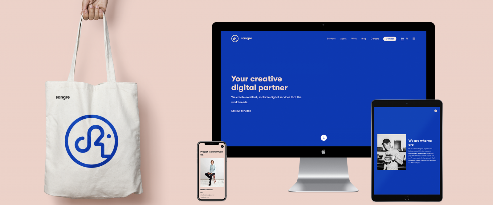
We design digital brand identities for our clients, and in 2019 it was time to give our own brand the same treatment. After some significant changes in our organization, we wanted to recreate our brand to better communicate who we are today. This meant creating a new identity system, including how the brand is presented visually and aesthetically as well as how the brand speaks to its users.
Our goal was to capture the brand’s honesty and create a strong visual system and language that stands apart from competitors. This identity system evolved and extended across a range of different touchpoints with a strong focus on digital.
1. Personality
The first step in the brand design process was to define the brand's personality. If our brand were a person, how would that person make the user feel?
Acknowledging emotion in the brand framework helps make products and services memorable. The challenge here was to design Sangre’s fundamental brand elements in a way that would strike a balance between emotion and technology. Most of all, people remember the emotions and experiences they associate with the brand. How they perceive the brand depends strongly on those feelings and experiences.
We started by asking some fundamental questions: Why do we exist? What's our brand’s unique proposition and its personality? In order to stand out, a brand needs to express personality, create deeper human connections and appeal to core values.
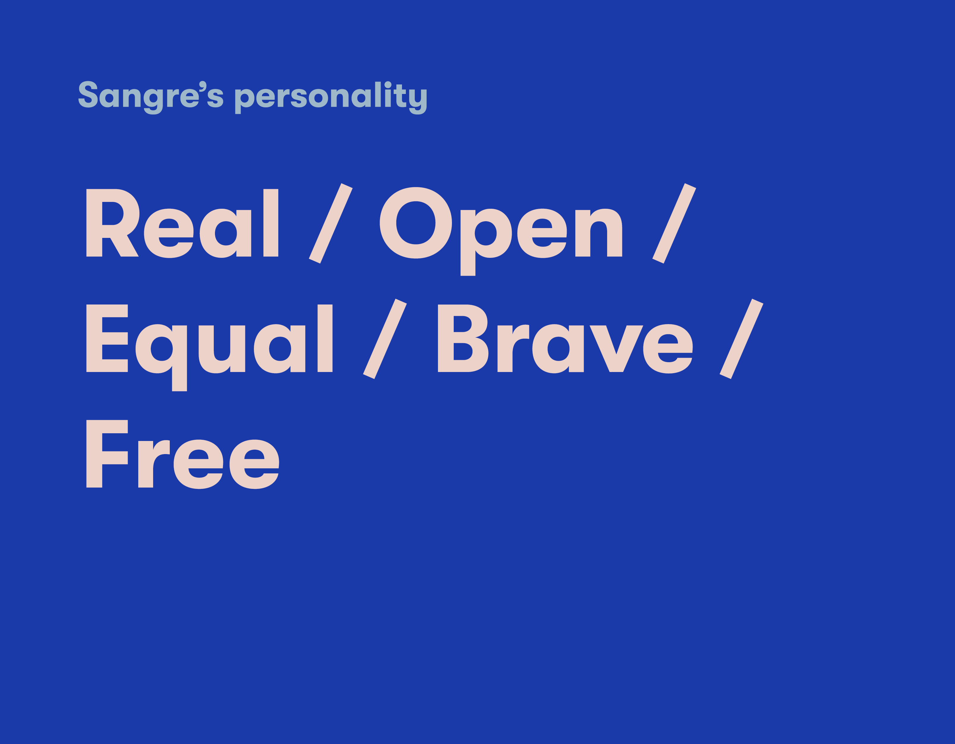
We defined the personality aspects that the brand embodies, describing who we are, what we stand for and what kind of service we're offering to our customers. We designed Sangre to be a creative, honest, bold brand that would give off the aesthetic of a design agency while remaining innovative, accessible and trusted by those in its tribe. Only after putting the brand’s values in words can we design an identity that's in line with the brand strategy.
2. Logo
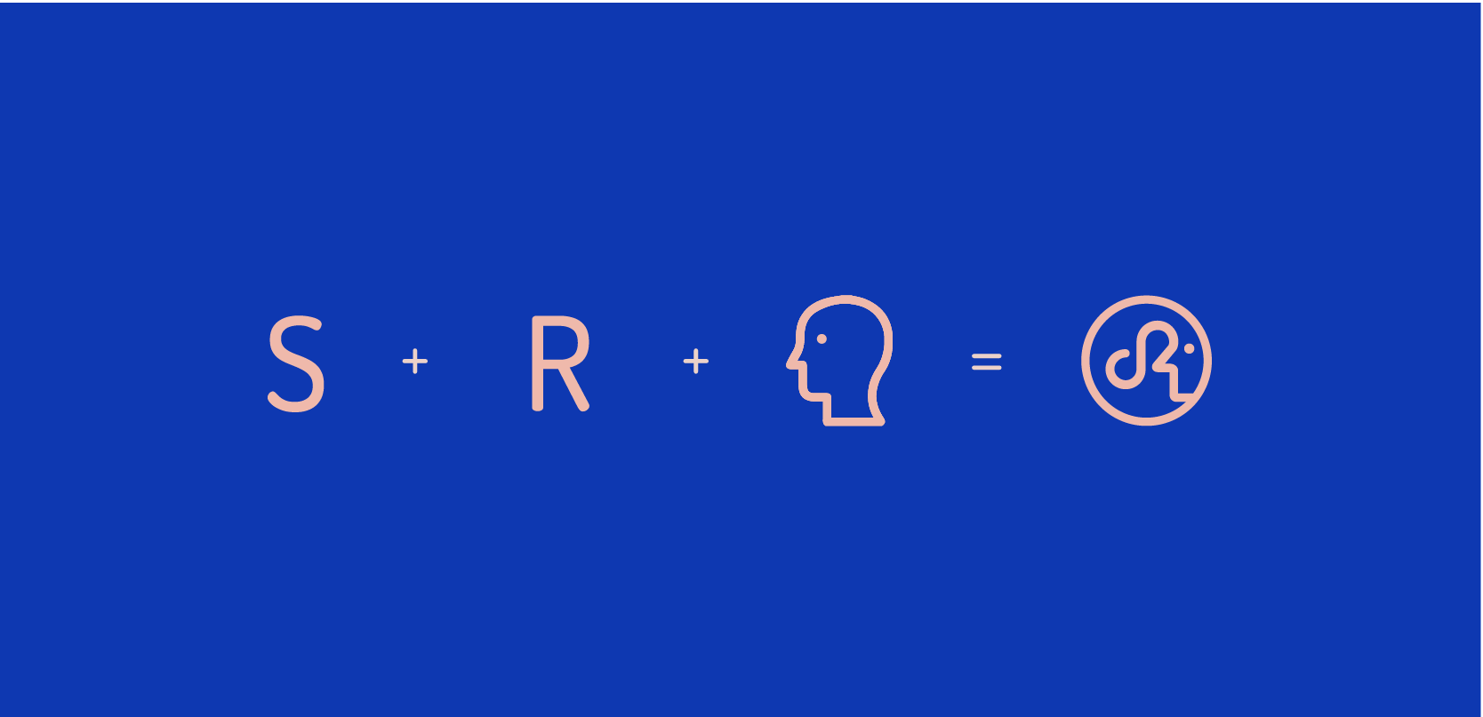
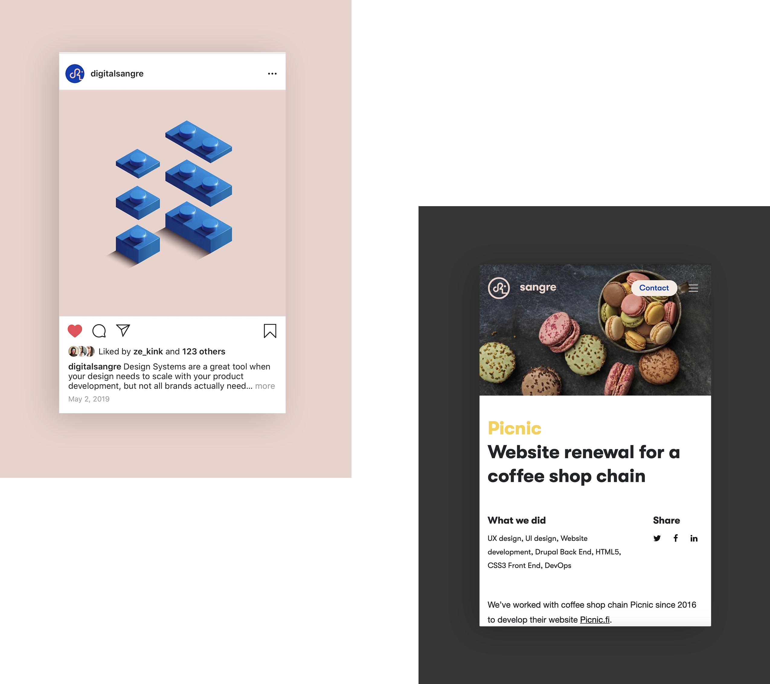
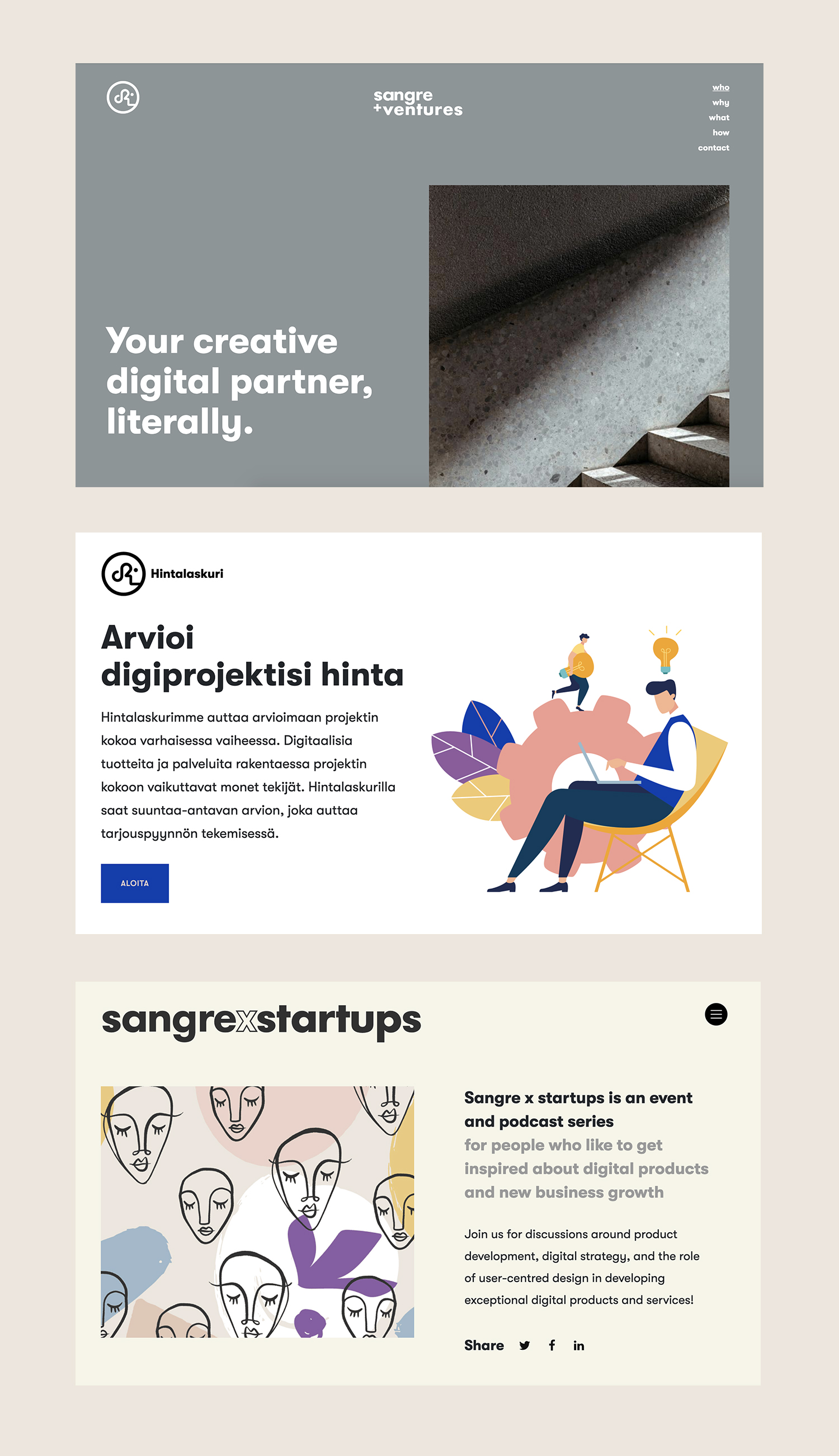
We're driven by user-centric design, so we put it in our logo. The idea centers around showing the human face and incorporating our brand initials. Unlike other digital agencies that often feature just a typeface as a logo, we wanted to focus on genuine emotions and design a logo that is fun, unexpected and stands out. Our logo carries our core value in everything we do - always putting people over technology. After all, we’re humans creating digital services for other humans.
3. Colours
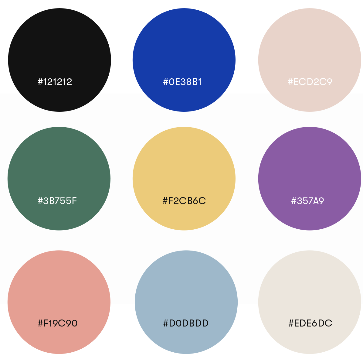
Our colour palette is bright and playful. The colour blue gives the feeling of stability, while the colour pink creates playfulness and keeps the look fresh and modern.
4. Typography
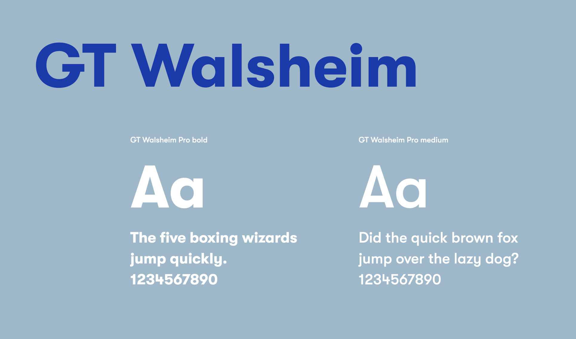
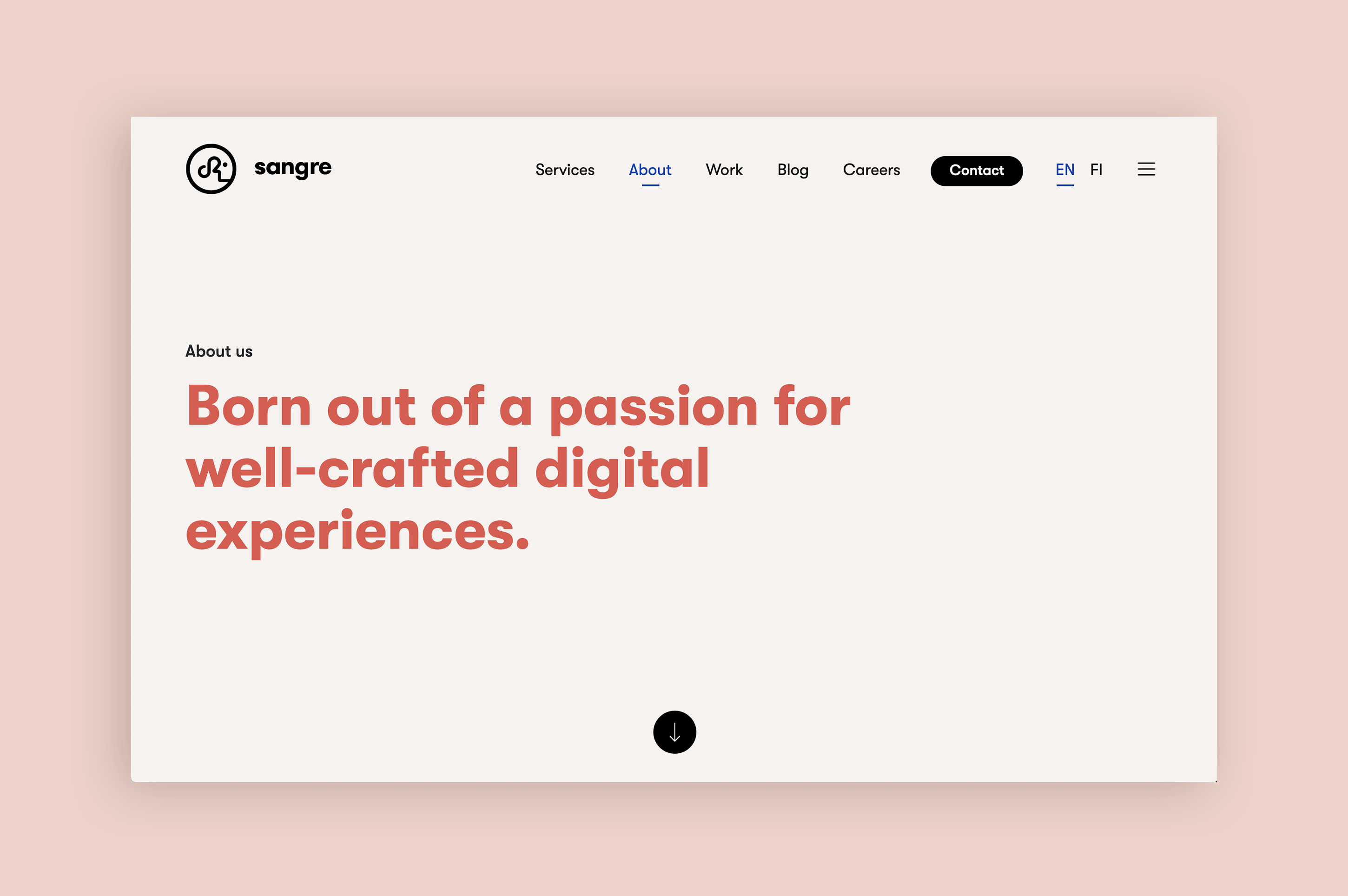
For our typeface, we chose GT Walsheim. The typeface, inspired by the lettering of Swiss poster designer legend Otto Baumberger from the 1930s, is designed to feel friendly but bold and precise at the same time. It looks great in large size copy in various formats and applications, online and offline, and is often used to command attention.
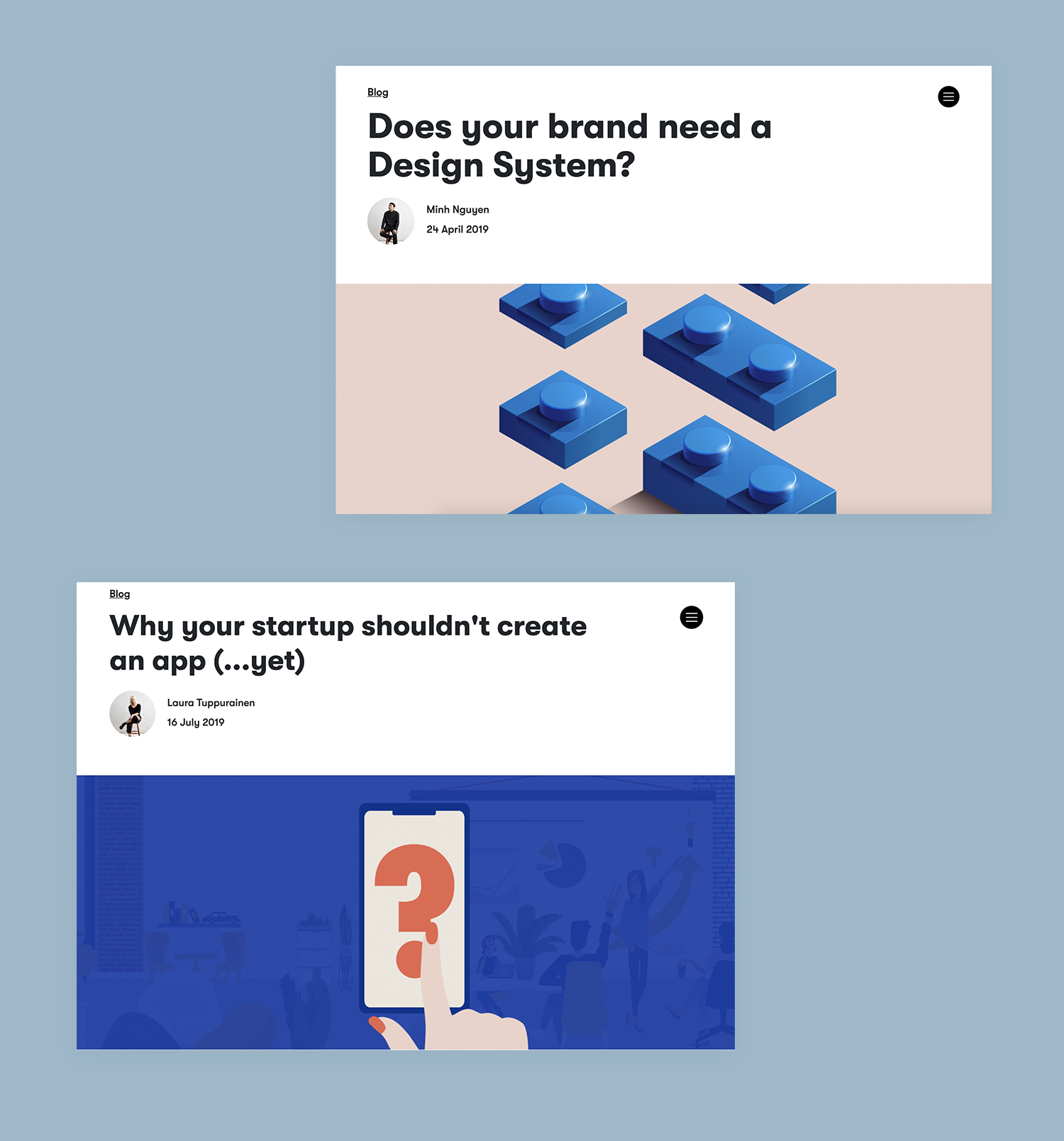
5. Imagery
The next step was to create our brand imagery. When designing our brand photoshoot, we first defined the story we wanted to tell with our images. Our goal was to achieve a fresh, honest documentary style inspired by journalistic photography, where the meaning comes from the context and subject.
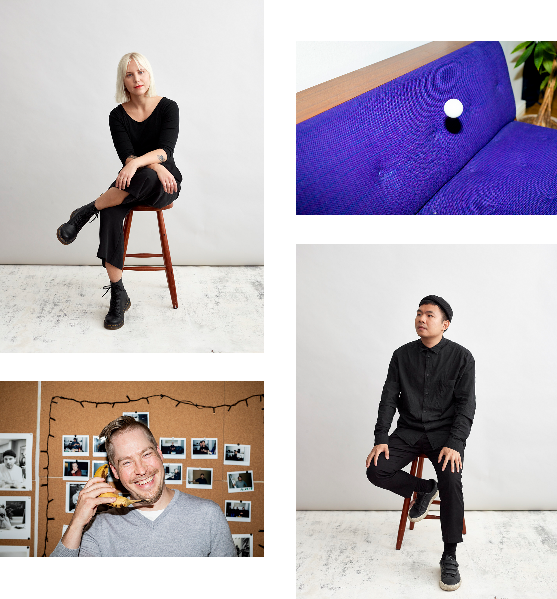
Visually we drew influence from the harmonious style of Kinfolk magazine, mixed with the fun straightforwardness of polaroids and direct flash photography. We wanted users to think of an artsy, creative digital agency, and avoid any look typically associated with tech or gaming companies. The final step was hiring photographer Jussi Ratilainen who shared our vision to execute the shoot with us.
6. Tone-of-voice
The tone-of-voice defines the way the brand image is communicated across different written media – how your brand engages with the world and speaks of itself to users.
Drawing from our brand's personality traits, we defined Sangre’s tone-of-voice with five words: authentic, straightforward, approachable, bold, and meaningful. These guide our wording and message on our website, social media, client communications and elsewhere.
7. UX/UI
The user experience is an integral part of a brand - after all, experiences are what users remember. Despite here being presented as the "final" step, UX really happens throughout the whole process of designing a brand.
Over the years, we've distinguished our style in the UX/UI design realm, and our designs are characterised by Scandinavian minimalism with an Oriental touch. We draw inspiration from usability engineer Jakob Nielsen and industrial designer Dieter Rams, creating designs that combine a rational approach with meaningful thinking.
Our designs are characterised by Scandinavian minimalism with an Oriental touch.
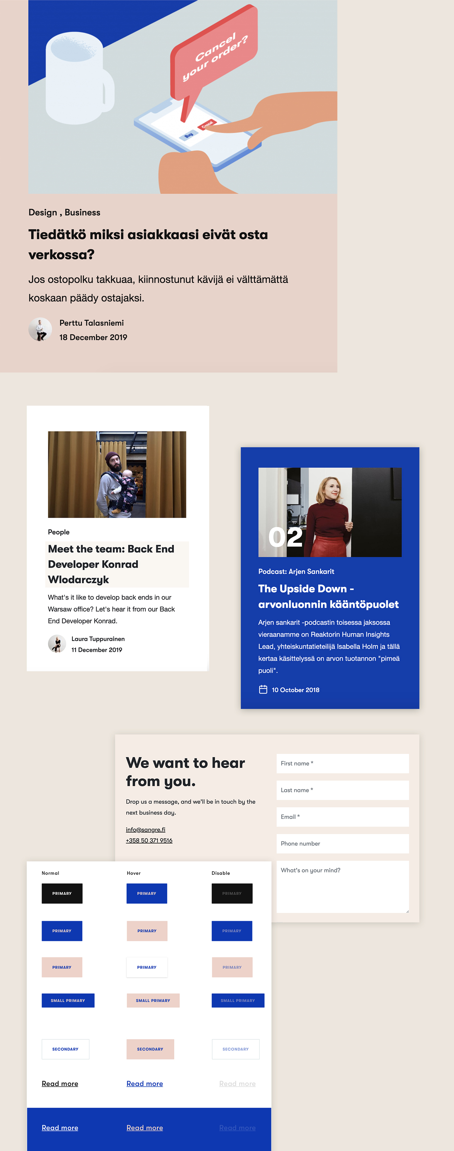
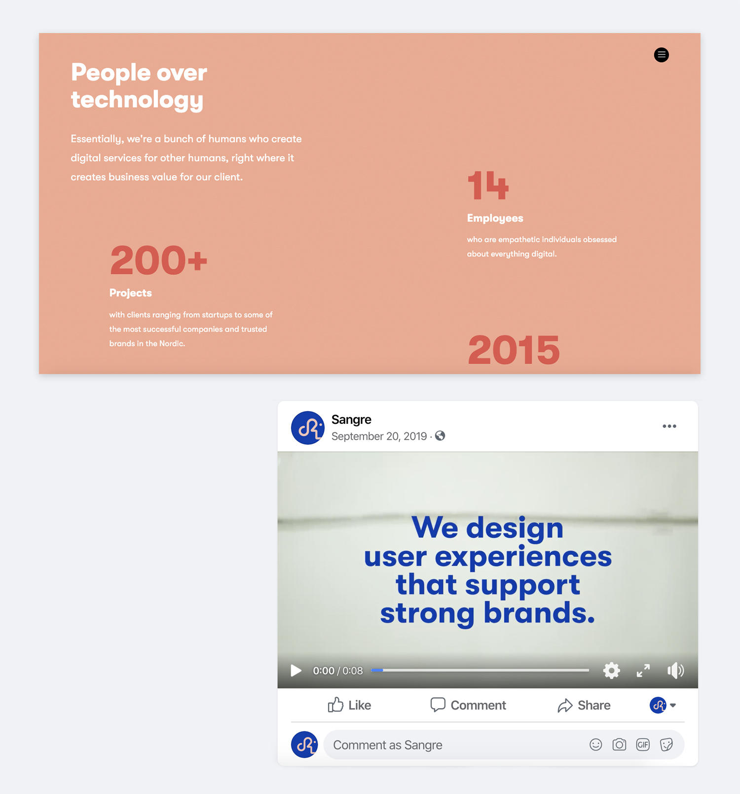
When designing our website's UX, we identified customers, defined key personas and thought of how they interact with our brand in the digital landscape. A brand-aligned user experience allows users to empathize with our brand and find their needs and desires easily. We analyzed our user journey map to capture untapped opportunities. The site navigation was redesigned with a more clear structure, optimizing the customer experience and flow.
Online customer journeys are happening from beginning to end often without any human interaction at all. Trust is built on an abstract level, through various levels of the UI. Every touchpoint in the digital service is a touchpoint with the brand, and design has a much bigger role in enforcing a brand in the digital age.
The result: a flexible yet coherent brand
We designed our brand in such a way that we could create strong sub-brands around it without losing touch with our identity. Our sub-brands represent different products and services with unique purposes - sister companies, podcast and event series, and web applications. The sub-brands work not only as their own stand-alone brands, but they also help to serve our users better while supporting and strengthening the main brand.
A strong technology, well-executed design, and great branding create a winning product. Does your brand align with your digital touchpoints and user experiences? If you're unsure, drop us a message or book a free 15-minute consultation below. We're happy to help.
The writer is a Visual & UI Designer and a founding partner at Sangre.